
Color Schemes Set the Tone
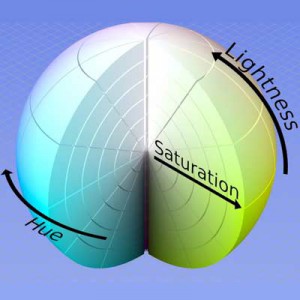
Munsell color sphere
What is a color scheme?
As Dictionary.com defines it:
an arrangement or pattern of colors or colored objects conceived of as forming an integrated whole
As designers, we are trained to seek out color schemes to communicate an idea and to justify its use in our work, whether it’s a graphic logo, a painting or even an interior space.
While the Dictionary.com definition above seems pretty straightforward, what it doesn’t mention are the proportions of said arrangement of colored objects and their proximity to one another, which can affect the integrated whole.

Example of analogous color scheme used in AB&C’s branded communications
Rather than ramble on about color theory like a physicist, I’ll try to be straightforward too. Color schemes are just different groupings of colors that combine to form categories such as Value (color lightness/darkness), Hue (color or tint) and Saturation (color intensity), as well as Complementary, Analogous, Triadic and Tetradic. These last four groupings refer to colors that exist on the Munsell color sphere, developed by Albert Henry Munsell, American painter, art teacher of art and inventor of the Munsell color system. In the Munsell color sphere, complementary colors exist on opposite sides, analogous colors exist on the same side, triadic colors contain at least two analogous color and one complement, and tetradics contain two sets of complementary colors. Play the Color Theory Game and try your hand (and eyes) at selecting colors that will illustrate these different color schemes. After a while, you might come away with a deeper understanding of how colors influence each other and how their relationships affect the overall look.
Whether consciously or subconsciously, we designers rely on some version of this system to arrive at the color schemes we use—most of the time. Of course, some color arrangements are simply subjective. By grouping colors in these various ways, we can create designs that appear warm or cool, active or serene, loud or discreet, fun or reserved—whatever will best communicate the desired concept.
Sign up to receive our industry trends newsletter: